About
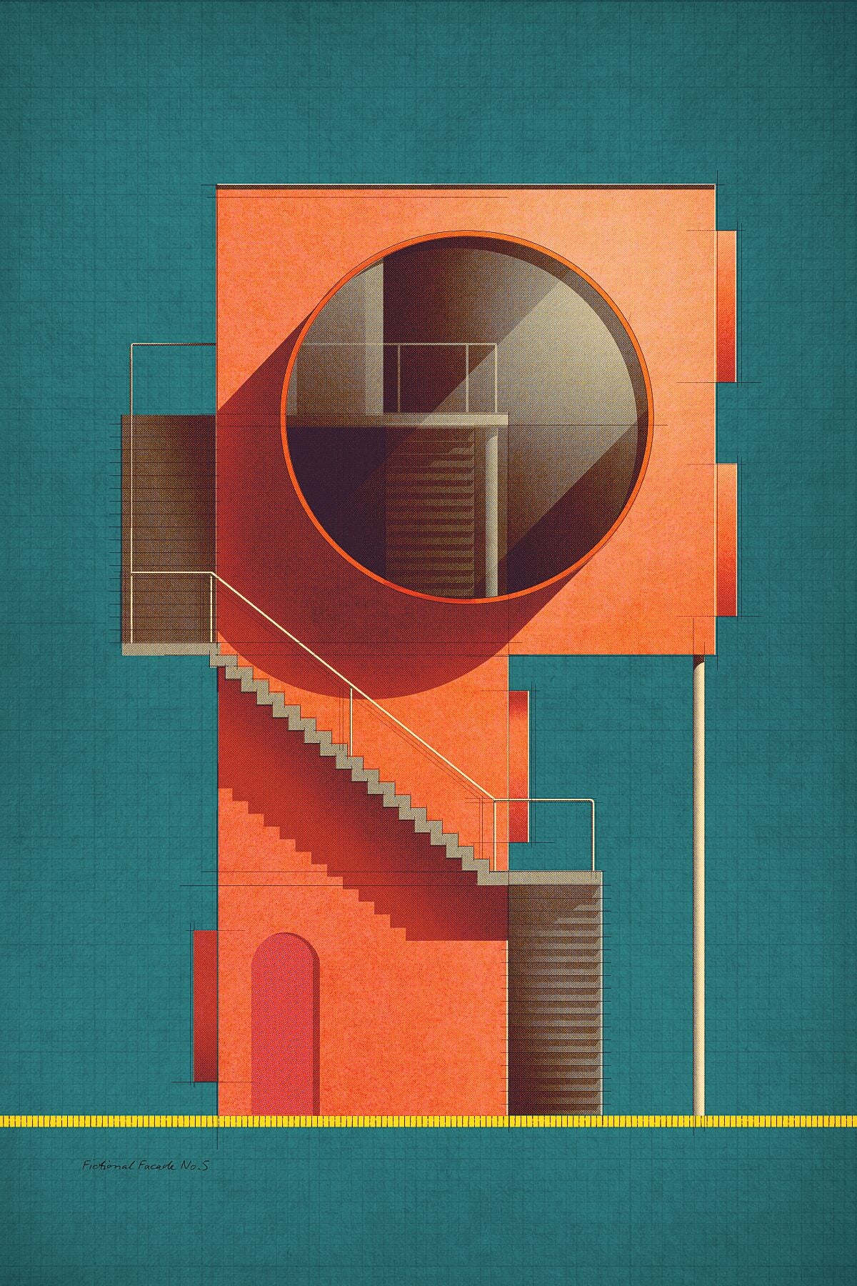
Hi, I'm a book cover designer and digital artist based in Amsterdam. Influenced by traditional techniques, and with a focus on color and light, I aim to work layer by layer to create texture and depth reminiscent of the craftsmanship of the last century. With these prints I honor architects and designers and their iconic buildings and interiors for their exceptional compositional harmony: something, I think, truly characteristic of 20th century architecture and design. Alongside these icons, I also draw fictional facades and geometric compositions in the spirit of Bauhaus and De Stijl. |
PRESS: From time to time, works arrive at our newsroom that, due to their particular approach, excellent execution and overwhelming beauty, lift us from our chairs and make us, at the very least, break into applause . Without a doubt, this is the case of the digital paintings of the Dutch designer and illustrator, Sander Patelski , in which, with superlative good taste, he portrays real and fictional buildings with unusual precision and aesthetic flight. The unnamed series, open and in development, began to take shape during the hardest months of the confinement caused by the pandemic , this is probably one of the reasons why each of Patelski's plates exudes that warm nostalgia, evocative and family. First it was architectural icons like the Case Study House No. 8, by Charles and Ray Eames or the Guggenheim in New York, by Frank Lloyd Wright, those immortalized with Patelski's digital brush , these gave way to the true stars of the series, theoretical constructions, drawn from the imagination of a tireless creator who, until then, had made a career —and a very good one— in the publishing sector. Below we share a handful of works that are good for better understanding Sander Patelski, his technique and, above all, his vision." Source: experimenta.es
If you are an art and architecture lover looking for the perfect print to decorate your home, the work of Studio Sander Patelski might be just the thing. Patelski creates vibrant pieces inspired by modernist architecture and design. His catalog includes stylized versions of iconic buildings like Case Study House No. 8 by Charles and Ray Eames and the Solomon R. Guggenheim Museum by Frank Lloyd Wright. He also recreates stylish modern interiors, fictional façades, and more conceptual compositions of colors and shapes. Patelski's artistic process begins with a deep dive into his chosen subject matter. “When I come across a building or interior I like to do, I gather as much material as I can find,” the artist tells My Modern Met. “…I want to ‘understand’ the building or space as much as I can before I start the drawing.” Patelski does not have a background in architecture. His series came from a shortage of freelance work and an abundance of time felt by many artists due to the COVID-19 pandemic. When this happened, the artist finally got the chance to draw the early and mid-century modern styles he had always appreciated. Though Patelski shares that his favorite piece is often the one he has most recently completed, the series allowed him to study the architecture of Juan O’Gorman. He is now especially fond of these drawings in his series. One O’Gorman inspired piece—Casa Estudio de Frida Kahlo—is included in this article. After so many pieces, Patelski has developed a library full of interesting textures and overlays. “I use a lot of halftone patterns because they make the illustration more vibrant,” he explains. “Also I keep in the rough sketch. It’s always nice to see the drawing come to life when I start adding the shading, and start playing the colors.” Patelski says that he will soon bring his two-dimensional drawings to a new medium starting with small sculptures inspired by his composition studies and fictional façades. Be sure to keep up with him on his website for new prints and this alternative medium in the near future. Source: mymodernmet.com
Sander Patelski is a digital artist from Amsterdam with an extremely coherent portfolio with graphics presenting his personal view of modernist architecture. When you look at his compositional sketches, it is really hard to believe that he has no special education. As it turns out, passion and excess free time can be a sufficient driving force to develop a body of work. The period of the COVID-19 pandemic has marked a professional slowdown for many and forced isolation from the outside world. Patelski made these unfortunate circumstances his greatest asset, devoting this difficult time to developing a style that quickly became his trademark. In this way, the independent creative activity turned into a dynamic portfolio of the artist under the name: Studio Sander Patelski. The area of interest that the artist explores in his creative work is the harmonious beauty of architecture, graphic design and visual arts of the first half of the 20th century. In all of Patelski's works, one can see the praise of the simple geometry of forms, intersecting lines at right angles and flat surfaces, characteristic of that period. Large, massive structures and homogeneous solid elevations gain a characteristic, rhythmic structure devoid of unnecessary details. At the same time, Patelski developed a very coherent and consistent language of expression. It is characterized by exceptional compositional discipline and craftsmanship, which treats even the smallest detail seriously. Each project is preceded by a thorough and deep analysis of the building or interior he wants to draw. Then, referring to traditional techniques - layer by layer - he brings a given object to life, emphasizing each creative stage thanks to sketches visible in the background. As a result, his works are hand-prepared plans that delight with their authenticity. The rich portfolio of the artist's works includes, above all, graphics that represent real pearls of modernism - buildings designed by Charles and Ray Eames, Frank Lloyd Wright, Alvar Aalto, Kishō Kurokawa and Walter Gropius. However, many of Patelski's projects are also based on his own ideas. His proposals of fictional facades, abstract compositions and original interior arrangements inspired by the style of the middle of the last century are based on the basis of the classics. At the same time, the quality of these projects does not differ in any way from that presented by prominent architects.
Patelski complements the game of forms characteristic of modernism with a careful selection of refined colors with which he fills his compositions. He boldly uses a palette of strong, slightly subdued red, yellow, blue and black accents supplemented with pastels. These colors are complemented by large areas of white, gray and beige, which imitate the structural concrete characteristic of modernism. It is the skillful use of colors that makes Patelski's works have such a unique atmosphere. Simple, cubic forms devoid of ornamentation gain unexpected energy that allows you to look at the modernist achievements in a new, invigorating way. In his work, the artist also uses a rich collection of interesting textures and patterns that give his compositions additional depth. At the same time, cleverly planned details make the solids look more multidimensional and realistic. Patelski emphasizes them additionally, playing with the presence of light, which casts shadows on the surfaces that contrast with the whole. All these endeavors make Patelski's simple, two-dimensional sketches literally come to life on paper, and it's hard to take your eyes off them. Perhaps it was the desire to revive his creativity that prompted the artist to consider exploring other media. He plans for the near future, for example, to transfer his compositions of solids and facades to small sculptures. If the plan is successful, Sander Patelski's ideas will materialize and can be touched. Source: Label Magazine
|